Triumph of imperfection: Juggling Frogs shirts for the kids

When Hannah saw what I was doing yesterday morning, she called out to the others, "Eema's at it again. She's doing it again!. Eema has a website, so we're getting shirts again...."
I made these shirts yesterday, using the Gocco machine and some spare t-shirts. This was an exercise in Cafepress avoidance. They offer too many tempting and cute items. Consider this was a defensive budget-protection maneuver.
I always tell the kids that "Nobody is perfect, except HaShem, so strive for excellence, not perfection." My father-in-law says, "The Perfect is the enemy of the Good."
Making these home-made t-shirts certainly gave me quite an opporutnity to prove that I practice what I preach. I got to demonstrate making the best of myriad mistakes as "teachable moments."
Okay, that's my story and I'm sticking to it. It sounds so much better than, "I can't believe I'm making the kids wear these patchkied-up t-shirts...."
I started with the idea that everything would fit on one master Gocco screen. This was going to be a quick, monochrome (green stamp ink for cloth), cheap (leftover green ink from a long-ago project, spare t-shirts from our stockpile) project. I was going to outsmart Cafepress and have the kids in shirts in 15 minutes. Ha!


When I did the first test-print on paper, I realized that only part of the URL for Juggling Frogs made it onto the screen. I didn't want to waste a screen, so I taped up that part with packing tape, to prevent it from partial printing. This worked well, but it was messy.

The first two shirts registered well. They did seem a bit too monochromatic, though.
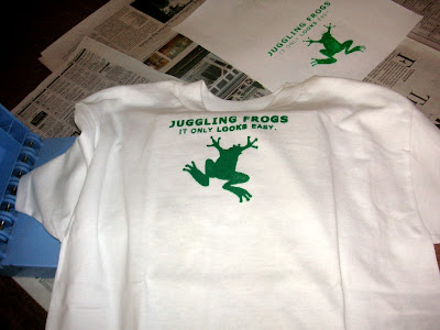
This picture shows how the rest of the shirts didn't get a complete impression from the screen print. I think this happened because the ink was old. The cloth ink is much more difficult to work with than the ink for paper. The paper ink never clogs the holes of the screen, and it stays wet/usable for days. When I use cloth ink, I have to move fast, before it dries up, blocking the holes.
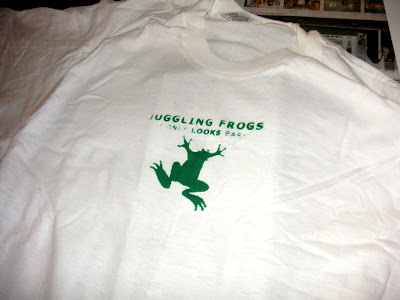 I touched the mis-registered/missing parts up using a paintbrush dipped in the excess stamp-ink-for-cloth.
 I thought I'd be clever, and make the URL for Juggling Frogs as big as possible, maximizing the screen space by flashing it onto the screen diagonally. I forgot that this would make lining up the words almost impossible.
 Instead of trying to line up the words carefully, I decided that a "random angle" URL placement was part of my design. The fact that this angle is different on each shirt is a feature, not a bug. I swear.
 Here are the completed shirts:
I thought the logo looked a bit too monochrome, so I added some color with fabric paints. This adds to the readily apparent subtle lack of quality control uniqueness of each shirt.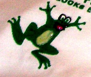
Here's a picture (taken in 2004) of the kids in their "Warning: If you get too close to me, my Mommy might moblog you" shirts:
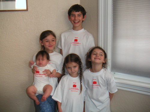
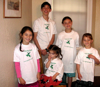
And, here they are this morning, in 2007, in their new Juggling Frogs t-shirts:
Here's Gretta in her moblog onesie, three years ago:

See also: How to make inexpensive quick t-shirts



0 comments, so far. Add yours now!
Post a Comment
Post a Comment